The Ultimate Guide to Visualization Tools for Marketers
Marketing is all about creating an emotional connection with your target audience, and one of the most effective ways to do that is through visualization. By using powerful visualization tools, marketers can create engaging and memorable experiences that resonate with their audience and drive real results. In this guide, we will explore some of the best marketing visualization tools available and how they can help you improve your strategy.
Table of Contents
Introduction
- Top 10 Visualization Tools for Marketers
- How to Choose the Right Visualization Tool for Your Business
- Best Practices for Using Visualization Tools in Marketing
FAQs
Introduction
Marketing has become increasingly complex in recent years, with businesses facing fierce competition and constantly evolving consumer behaviors. To stay ahead of the game, marketers need to be able to connect with their audience on an emotional level and create memorable experiences that resonate with them. One of the most effective ways to do that is through visualization, which can help marketers make complex data more accessible and engaging for their target audience.
Visualization tools have become increasingly popular in recent years, with businesses using them to create powerful marketing dashboards, visualize customer journeys, and gain insights into consumer behavior. In this guide, we will explore some of the best marketing visualization tools available and how they can help you improve your strategy.
Why Visualization Matters in Marketing
Visualization is a powerful tool that can help marketers create engaging and memorable experiences for their target audience. By using data visualization tools, businesses can make complex information more accessible and easier to understand, which can help them connect with their audience on an emotional level and drive real results.
There are several reasons why visualization matters in marketing:
- Attention span: With so much information available online, consumers are becoming increasingly selective about the content they engage with. Visualization tools can help marketers make their content more engaging by presenting it in a way that is easy to understand and remember.
- Understanding complex data: Many businesses collect vast amounts of data about their customers and their marketing campaigns, but this information can be difficult to analyze and make sense of. Visualization tools can help businesses make sense of this data by presenting it in a format that is easy to understand.
- Improving decision-making: Visualization tools can help marketers make more informed decisions about their campaigns by providing them with insights into customer behavior, campaign performance, and other key metrics.
- Driving engagement: By creating engaging visualizations, businesses can increase the time people spend on their website or social media page, which can help them build a stronger connection with their audience and drive more conversions.
The Benefits of Using Visualization Tools
There are several benefits to using visualization tools in your marketing strategy:
- Improved decision-making: Visualization tools can help marketers make more informed decisions about their campaigns by providing them with insights into customer behavior, campaign performance, and other key metrics.
- Better engagement: By creating engaging visualizations, businesses can increase the time people spend on their website or social media page, which can help them build a stronger connection with their audience and drive more conversions.
- Greater accessibility: Visualization tools can make complex information more accessible and easier to understand, which can help businesses connect with their target audience on an emotional level.
- Improved storytelling: Visualizations can be used to tell compelling stories about your brand, products, or services, which can help you engage your audience and build a stronger emotional connection with them.
- Increased efficiency: By providing a single source of truth for your marketing data, visualization tools can help businesses streamline their decision-making processes and improve the efficiency of their campaigns.
Top 10 Visualization Tools for Marketers
There are many different visualization tools available to marketers, but some of the most popular include:
Tableau
Tableau is a powerful data visualization tool that allows businesses to create interactive dashboards and reports. It includes a wide range of chart types, including line charts, scatter plots, bar charts, and more. Tableau also includes a drag-and-drop interface that makes it easy to create custom visualizations without requiring any coding skills.
Power BI
Power BI is a cloud-based data visualization tool developed by Microsoft. It allows businesses to connect to their data sources, create interactive dashboards and reports, and share insights with their team.
Power BI
includes a wide range of chart types, including line charts, scatter plots, bar charts, and more.
QlikView
QlikView is a business intelligence platform that allows businesses to create custom applications for their data. It includes a wide range of chart types, including line charts, scatter plots, bar charts, and more.
QlikView
also includes a drag-and-drop interface that makes it easy to create custom visualizations without requiring any coding skills.
Domo
Domo is a cloud-based data visualization tool that allows businesses to connect to their data sources, create interactive dashboards and reports, and share insights with their team. It includes a wide range of chart types, including line charts, scatter plots, bar charts, and more.
Looker
Looker is a data visualization platform that allows businesses to create custom applications for their data. It includes a wide range of chart types, including line charts, scatter plots, bar charts, and more.
Looker
also includes a drag-and-drop interface that makes it easy to create custom visualizations without requiring any coding skills.
Tableau Server
Tableau Server is a cloud-based data visualization tool developed by Tableau that allows businesses to store and share their dashboards and reports securely. It includes a wide range of chart types, including line charts, scatter plots, bar charts, and more.
Tableau Server
also includes a drag-and-drop interface that makes it easy to create custom visualizations without requiring any coding skills.
Power BI
Desktop
Power BI Desktop is a desktop version of the
Power BI
platform that allows businesses to create custom applications for their data. It includes a wide range of chart types, including line charts, scatter plots, bar charts, and more.
Power BI
Desktop also includes a drag-and-drop interface that makes it easy to create custom visualizations without requiring any coding skills.

Tableau Public
Tableau Public is an online community for data visualization that allows businesses to share their dashboards and reports with the public. It includes a wide range of chart types, including line charts, scatter plots, bar charts, and more.
D3.js
D3.js is a JavaScript library for creating data-driven documents. It allows businesses to create custom visualizations using HTML, SVG, and CSS, and it supports a wide range of chart types, including line charts, scatter plots, bar charts, and more.
Plotly
Plotly is an open-source data visualization tool that allows businesses to create interactive dashboards and reports. It includes a wide range of chart types, including line charts, scatter plots, bar charts, and more.
Plotly
also includes a drag-and-drop interface that makes it easy to create custom visualizations without requiring any coding skills.
FAQs
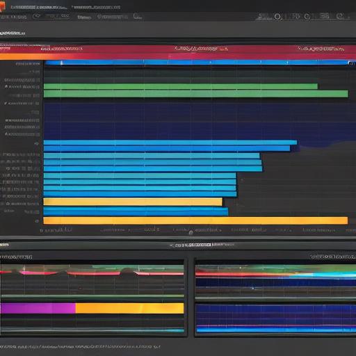
A PLACE FOR A PICTURE #2
1. **What is data visualization?**
Data visualization is the process of representing complex data in a visual format, such as charts, graphs, and maps. It can help businesses make sense of their data, identify trends, and make more informed decisions about their campaigns.
2. **What are the benefits of using data visualization tools?**
The benefits of using data visualization tools include improved decision-making, better engagement, greater accessibility, improved storytelling, and increased efficiency.
3. **Which is the best data visualization tool for marketers?**
There is no one “best” data visualization tool for marketers, as different tools may be more suitable depending on your specific needs and goals. Some popular options include Tableau,
Power BI
,
QlikView
,
Domo
,
Looker
,
Tableau Server
,
Power BI
Desktop,
Tableau Public
,
D3.js
, and
Plotly
.
4. **How do I create a data visualization?**
The process of creating a data visualization will depend on the specific tool you are using, but most tools include a drag-and-drop interface that makes it easy to create custom visualizations without requiring any coding skills.
5. **What kind of data can be visualized?**
Data visualization tools can be used to represent a wide range of data types, including quantitative data (such as numbers and percentages), qualitative data (such as text and images), and spatial data (such as maps and geographic information).